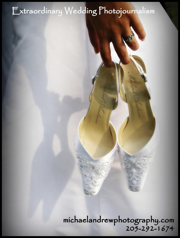
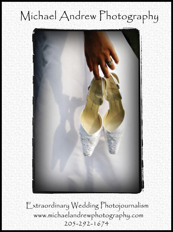
So I am designing next years ad and think I have it narrowed down to three. I am also considering a collage type ad where there are lots of smaller pictures instead of one big one. I like this picture, but the risk is someone may look at it and not like it, where with a collage type ad, usually one or two of the many will stand out to them, if not all. Help me choose which one you think is the best. I am going for an edgy, classy type feel. 


Viewing one post | view all recent posts


Definitely the first one… inmo, it looks way more professional than the 2nd and 3rd, they look more home made and less professional, I think.
agreeing with Apple on this one. At first glance it is just striking. The other two just don’t even compare.
It depends on where the ad will be? A magazine? A poster?
looking at it more closely I like all 3, however, the first is big, the wording blends in more than stands out meaning it doesn’t take anything away from the picture. The other two is more of the advertising of YOU meaning the heading and the information stand out more so than the picture. Make sense? That’s why it depends where the ad will be.
the ad will be my main ad (full page color) of Alabama Weddings Magazine. Thank you for your input so far!
yeah- my first thought was that the first one looks like a magazine page and the other two look like postcards or something.
Definitely the first one then, if it is going in a magazine. Out of the other two, I like the one with the white border best, it is much sharper and makes the picture pop, but not what I would put in a magazine. I agree with apple, I would go with the first one.
its interesting to me all the different comments I am getting. I showed it to a magazine editor today…she liked the last one best. Please keep them coming!
i disagree about the 1st one going into the magazine. The first picture is something that should go into a portfolio or on a poster because then people will see "oh my gosh, that’s gorgeous, who took that?"
If it’s in a wedding magazine they will be looking for a photographer and it helps that you see the picture so you get a taste of what you’ll be getting.
I hope that made sense to you. I want to see what you were you planning for the collage.
I like the second and third because the words don’t get lost in the picture. There is more of a humility in these last two. Your telling them who you are but letting the picture speak edgy for itself. They are already thinking the picture is extraordinary before they read it 😉 The third background looks classy with the pattern that ties everything together.
I think showing these was one of the best things I could have done. I showed them to a graphic designer who liked the 1st one a lot more, but said there were some flaws, like my company name is no where to be found except in the web site addy. He also said he read it as Michael and Rew Photography, which is something I dont want. I think the feedback has been great, keep it coming, in the mean time I will get the collage version going. 🙂
lol, I can see where he got that. If I didn’t know you, I might have read that as well. I still say the first one. For a full page advertisement, you need to fill the whole page and not have a border. If you look at wedding magazines, all full page advertisements are pictures that go all the way to the edge. If it was a quarter page ad, then I would use one of the other two. I am excited to see the collage though, that may just be the way to go.
I vote for number one!